Photography by Tina Sargeant
Three office spaces that prove the environment in which you work can have an essential and positive impact on the work itself
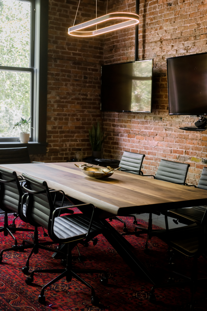
Seventeen20, a local furniture designer, created this beautiful boardroom table. Fun fact: Laura Shannon’s clients love to hunt and were delighted to find the surprise of bullet remnants in the table intentionally chosen by the designer.
It should be no surprise that innovation in office design has a strong American legacy. The home of the world’s most successful companies also made early strides to improve the form and function of our workspaces through design. Creative office spaces may seem like a millennial start-up trend, but legendary architects and designers like Frank LLoyd Wright and Herman Miller worked with huge corporations as early as the 1930s to create workspaces that pioneered new ideas.
Whether the goal is to increase productivity, creativity, or collaboration, the design of a workspace can be a major contributor to how work is done and how we feel doing it. The modern, open-office concept embraced in recent decades has deep roots in the past. Wright actually called the boxiness of traditional offices “fascist” and that “the architecture of freedom and democracy needed something besides the box.”
This idea of an office that is open and harnesses the power of human interaction while balancing specific needs for focus and privacy has long been the gold standard. It has seen many iterations and modifications over the years, with varying degrees of success.
Here, we highlight three local offices that apply these ideas in different ways. These inspiring spaces also feature the work of local interior designers, architects, artists, and furniture makers combined to create workplaces that are not only beautiful and functional, but unique to Lakeland.
The Downtown Loft
With beautiful views of Munn Park, this space embraces its home in a historic brick building while incorporating a modern color palette and a variety of modern conveniences. Laura Shannon, who spearheaded this ambitious office design, shares her approach to the project.
[modula id=”23276″]
[columns_row width=”half”]
[column]
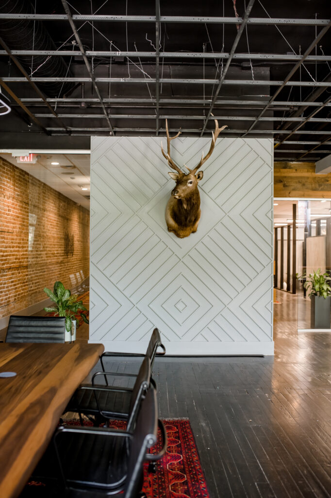
Elk wall by Strickland Construction
[/column]
[column]What part of this office design are you most proud of and why?
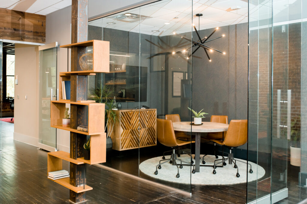
Laura Shannon: We had so much fun designing this office, and the flow of the space was really important to our clients. The very unique spot was the common work area. We found a gorgeous round table that can adjust in height, allowing them to sit or stand while looking through plans. Behind the round table is also a custom-built drafting counter. It can lay flat when they need it for a more standard countertop setting, or be slid up into the wall and become a space to unfurl their blueprints. Joey Cambers, of Cambers Custom Design, nailed our out-of-the-box idea.[/column]
[/columns_row]
[columns_row width=”half”]
[column]
How did you pull off such a modern look in a historic building?
LS: We aimed to create a space that subtly shows the beauty and appreciation of construction. We put an emphasis on elements like wood, stone, glass, and steel as the common denominators to create a solid foundation throughout the office. While the client appreciates the history of the space (hello, exposed brick and original wood floor!), they also wanted to add a sleek sophistication, so we focused on clean lines and minimal detailing. Layering in bold colors, ambient lighting, leather, and thick woven fabrics then allowed for the space to also be warm and inviting.
[/column]
[column]
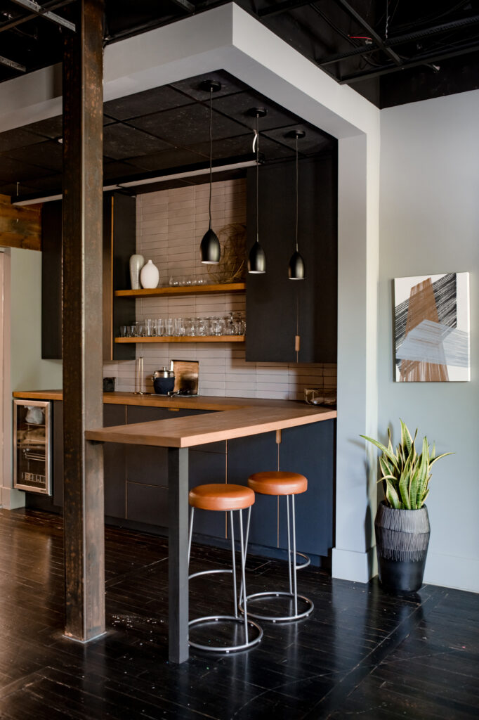
Custom cabinetry and desks by Joey Cambers, Cambers Custom Design
[/column]
[/columns_row]
NOT YOUR AVERAGE ATTIC
The visionaries behind this office design created a sharp, industrial yet luxurious space out of an unfinished attic. This sophisticated remodel is constantly admired by both clients and employees. We were privileged to chat with the team at CORE Wealth Advisors to learn what makes their new digs so special.
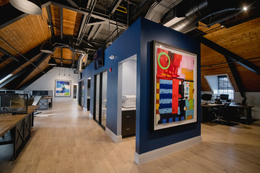
Custom original paintings in the open office space, by Florida artist Tony Eitharong. The pieces are eye-catching, and their substantial size demands attention while bringing bursts of color and interest to the large, open, industrial ceilings.
[columns_row width=”half”]
[column]
What is the most unique space in your office, and how is it used?
Core Wealth: Our lobby is our most unique office space. When you exit the elevator, you immediately step into a stylish and soothing space that instantly slows you down. At CORE, we desire everyone who comes to our office to have a meaningful experience, and this begins when the elevator doors slide open. Our lobby is quite the antithesis of the boring, dark office waiting room. The furniture is inviting and comfortable, the music and flowers are fresh, and the coffee/espresso is free flowing. The lobby is used for shorter gatherings (that don’t require a conference table), more private internal meetings (away from the open-concept design), and the occasional afternoon espresso break.
[/column]
[column]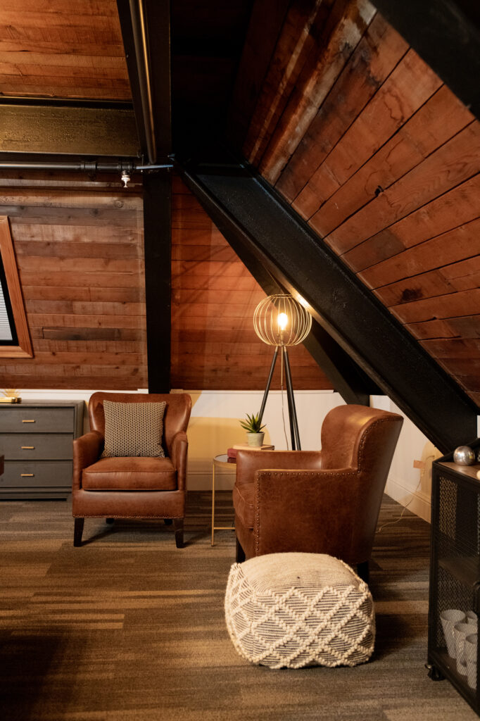 [/column]
[/columns_row]How is your space different from the typical office?
CW: The office was designed to be more than just an office — to provide a useful alternative to a rigid, “work-only” environment. The gym/locker room amenities allow for morning, late-afternoon, or even midday exercise; and the space can also accommodate group fitness classes. For those who prefer a break that is less physical, the hangout room and ping-pong table provide an equally enjoyable workday break. The office includes a full kitchen, privacy booths for phone calls and/or quiet, and meeting rooms for collaboration, in addition to the open-concept main area. The office design truly provides endless flexibility and variety for its users.
[columns_row width=”half”]
[column]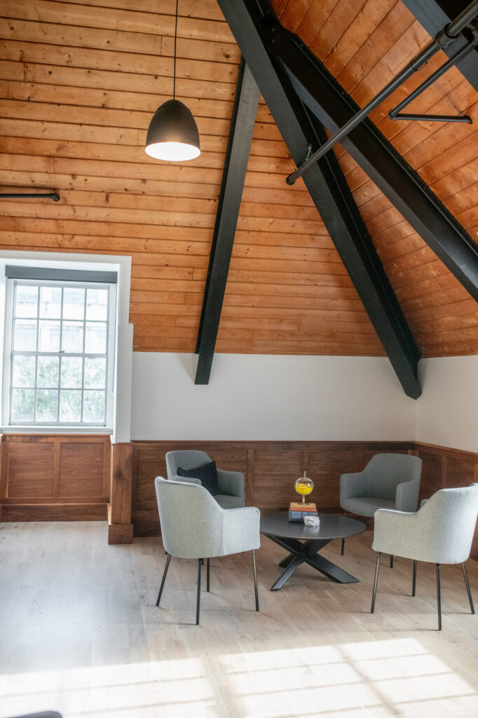 [/column]
[column]How would you describe what it’s like to work in this office?
CW: The main inspiration was more a feeling than a specific place. We wanted to “feel” something different than the feeling your normal boring office space evokes. We aimed for a balance of ambience with practicality, a balance of focus but also relaxation, and a balance of independence with collaboration.
[/column]
[/columns_row]
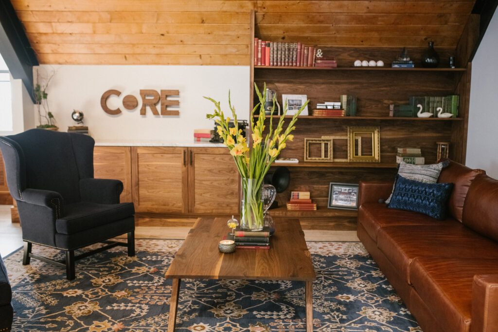
Lobby coffee table and custom woodwork — a combination of both art and furniture — by local designer Robert Berganza. His work in the lobby really set the vibe of this room: calm, but warm and relaxing.
FOR DESIGNERS BY DESIGNERS
The team at The Lunz Group is uniquely equipped to create a space that serves the specific needs of their busy architecture firm. In fact, their lakeside office is an award-winning design that is still a fantastic example of workspace innovation almost 20 years since its construction.
[modula id=”23279″]
You had the opportunity to build your office from the ground up. Tell us about the building itself.
Brad Lunz: A former single-story, pink house located on Lake Morton was completely converted into the modern, two-story office space we’re now known for today. The very striking building stands out and often receives comments on how unique it is. Our location can’t be beat, either. Our view of Lake Morton is unlike any other.
[columns_row width=”half”]
[column]What are some problem-solving aspects of your office design?
BL: Our office is nestled in the midst of historic buildings, ’70’s cubist architecture, and modern glass and brick office towers. Great pains were taken by the firm to meld the new office into the mélange of styles surrounding the lake, while at the same time creating a distinctive building that makes a statement on its own terms. This included working with the Historic Preservation Board and working diligently with code compliance to bring the building to what it is today.[/column]
[column]
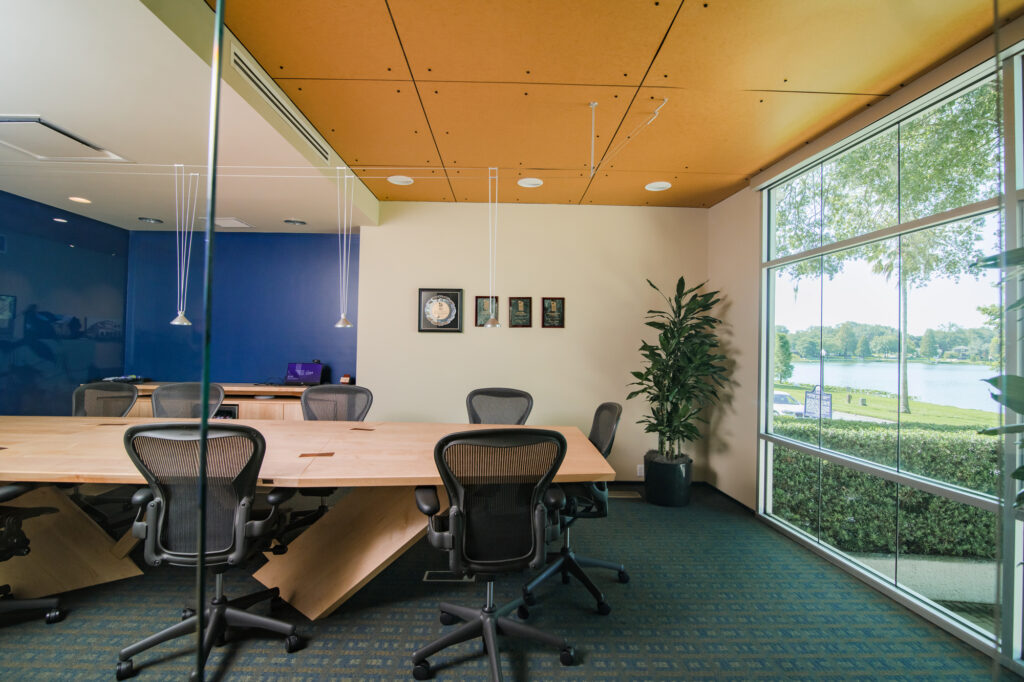
Downstairs, the recently updated conference room features a table that was crafted by Robert Berganza, local sculptural furniture designer and owner of Robert Berganza Furniture: a small business offering uniquely designed-and-created, high-end modern furniture pieces, handcrafted to order in-house.
[/column]
[/columns_row]
What is a unique way your team uses the space?
BL: Due to the collaborative nature of the design process, 90 percent of our office space is open office. We often will have impromptu, stand-up meetings as a team. We’ve even held meetings with our clients in our pods to design our projects together.
We also have an “outdoor conference room” which is a small patio with a couple of chairs and a table that make for a nice, quiet space for meetings or phone calls while getting some fresh air.
Our interiors room is one of the more fun spaces in our office. Clients will often come here to mix, match, and decide on the different materials they can expect to see in their space. Fun sample boards bring color and vibrancy to the space.

The Lunz Group actually designed their own office and received the H. Dean Rowe Award by the Tampa Bay American Institute of Architects the year it was completed in 2001. This award is given each year to a firm in the Tampa Bay area for excellence in design, craftsmanship, and innovation.

