THERE IS SOMETHING SOOTHING AND COMFORTING IN FARMHOUSE DESIGN. WHETHER IT BE OUR OWN GRANDMOTHER’S ORIGINAL HOME, THOSE DEPICTED IN THE ICONIC MAYBERRY USA, OR NOSTALGIC RANCH-STYLE WEDDINGS AS OF LATE, MOST OF US CAN RELATE. ALL THINGS FROM CHURCH, APPLE PIE, ROCKING CHAIRS ON THE FRONT PORCH, TO CHILDREN RUNNING BAREFOOT CHASING BUTTERFLIES REMIND US OF ENDLESS FAMILY MEMORIES FOUND IN THE FARMHOUSE. TAKE A VISIT WITH CHRISTIAN LEE THROUGH THIS MODERNIZED AND FUNCTIONAL DESIGN TO INSPIRE EVEN YOUR MOST RUSTIC BARNWOOD HAVEN.
PHOTOGRAPHY BY TINA SARGEANT
The American farmhouse dates back to the early 1700 colonials. Farmhouse design is sturdy and straightforward, characterized by a large covered front porch and a centrally located front door. A horizontal gable roof often extends over the porch and is intercepted by second-story dormer windows. Square columns support the flared roof and add a symmetrical feel to the efficient design. The house plan is generally functional and minimal. The covered porches help cool the interiors and provide a transitional shaded gathering place outdoors for family and friends. This was particularly important in the days before air conditioning. And the dorm windows help natural light penetrate the second floor and provide additional living space. Traditional and functional white clapboard siding adds a robust feel to the finished exterior.
Sometimes the way we live defies expectations. Several years ago, Brett and Leslie Blondell, a progressive young Lakeland couple, saw two acres of land and imagined a modern take on the traditional farmhouse. They wanted to maintain and protect the historic elements of farmhouse design while reimagining and updating those aspects necessary for their growing family. They planned to marry the feel and warmth of the traditional with the practical and functional expectations of today’s modern living.
The home is an interwoven mosaic of traditional farmhouse architecture with just the right measure of modern style.
The Blondells designed a home that fit the bill, and then hired me to help furnish and finish it. They had a very clear vision for each room and shared this on a modern-day inspiration board. Leslie set up a separate, private Instagram account for the two of us so that we could share photographs and keep them all accessible for easy reference in one location. If you are thinking of decorating and furnishing a new or existing home, the more photos and sources of inspiration (tile pieces, fabric swatches, paint samples, etc.) you can collect, the more direction it will give your designer to help you to achieve your goals. Due to a well-sourced Instagram storyboard, I understood what the homeowners wanted as we progressed, and we quickly learned to share a vision for the finished home.
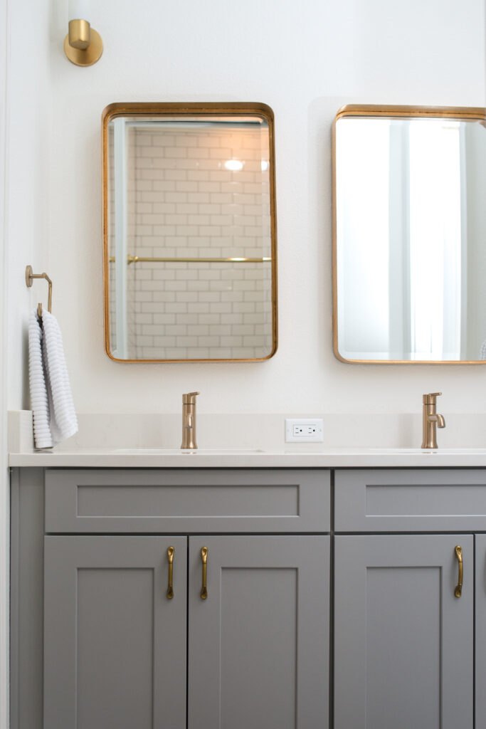
We started with the hard surfaces and worked our way through the house. We decided early on that we needed to use shiplap either on entire walls or to the chair rails, depending on the room. We selected quartz countertops for the kitchen. Complementing the custom, white shaker cabinetry, it is low maintenance and perfect for an active, young family. We used shades of white Carrera marble in the bathrooms with varied patterns. Some were herringbone. Some were offset brick patterns. I appreciated the continuity of the materials but did not want it expressed the same way in every bathroom. We put down gray wide-plank hardwood floors throughout the house except in the laundry room where we placed black-and-white cement tile. The cement tile serves as more practical and durable flooring for a laundry room.
I selected light fixtures for the ceilings and picked out white and soft-gray paint colors for warmth, with the goal in mind to shake up our traditional notions of farmhouse interiors. So, we also put a gold-patterned wallpaper on the ceiling in one of the kids’ bedrooms and a wood-patterned panel in another kid’s bathroom. We used marble and patterned tile backsplashes, installed a trough sink in a bathroom, and generally had fun with interesting patterns and textures. We looked for any excuse to hang cool wallpaper.
The furnishings and furniture needed to be arranged to accommodate large gatherings for Bible study and fellowship. We intended a place that would be comfortable and inviting. So we drew on the classic yet chic elegance of Anthropologie for inspiration. I found a beautiful ivory-colored leather Chesterfield sofa in Tampa, matching it with two wingback chairs covered in oatmeal linen. I discovered a perfect, oversized black leather ottoman in one of my out-of-town honeypots and placed it in front of the sofa. I love the contrast of colors and placed everything on the layered contrasting textures of custom sisal and Moroccan rugs.
I love the fact that the children are taking piano lessons on the same piano that their father grew up playing
We custom-designed and constructed a number of furniture pieces. We built an entry table of painted wood with a natural wood
top. We liked concrete tops and bases because of their durability and tried to use them whenever we could. The kitchen island is huge with tons of storage underneath, serving a dual purpose as a buffet for parties and a work station for food preparation. It also had to be long enough to anchor the large room and provide a place for the kids to eat and do homework. We splurged on high-end indoor-outdoor Janus et Cie wicker furniture for its comfort and durability around the pool. Once again, the family had a need to accommodate church gatherings for pool parties and fellowship and wanted a place drew on the classic yet chic elegance of Anthropologie for inspiration. I found a beautiful ivory-colored leather Chesterfield sofa in Tampa, matching it with two wingback chairs covered in oatmeal linen. I discovered a perfect, oversized black-leather ottoman in one of my out-of-town honeypots and placed it in front of the sofa. I love the contrast of colors and placed everything on the layered contrasting textures of custom sisal and Moroccan rugs.
We custom-designed and constructed a number of furniture pieces. We built an entry table of painted wood with a natural wood top. We liked concrete tops and bases because of their durability and tried to use them whenever we could. The kitchen island is huge with tons of storage underneath, serving a dual purpose as a buffet for parties and a work station for food preparation. It also had to be long enough to anchor the large room and provide a place for the kids to eat and do homework. We splurged on high-end indoor-outdoor Janus et Cie wicker furniture for its comfort and durability around the pool. Once again, the family had a need to accommodate church gatherings for pool parties and fellowship and wanted a place for people to hang out. I found an enormous, custom-made natural wood table for 10, with matching custom benches to complement the wicker furniture for the back porch.
In order to create an ambience of comfort and style, I like to mix and match unique elegant furniture, custom pieces, and vintage. I found an old apothecary cabinet and traditional vintage chair with charcoal fabric for a small gallery, a mid-century desk for the office, and a six-foot-long workmen’s bench for the foot of the master room bed. Since Brett is a church worship leader and musician, we prominently placed the piano he grew up with in the living room. I love the fact that the children are taking piano lessons on the same piano that their father grew up playing. For its history and family sentiments, it’s a rich piece to center the room around.
A perfect blend of traditional and modern, the home is an interwoven mosaic of traditional farmhouse architecture with just the right measure of modern style. A Chesterfield sensibility insinuated with dollops of quartz and edgy wallpaper. A kind of elevated and refined Anthropologie matched with comfortable living. This combination has created a home that is as warm and welcoming as the faithful family that built it.


