Architectural Photography by Philip Pietri
Portrait by Derek Forehand
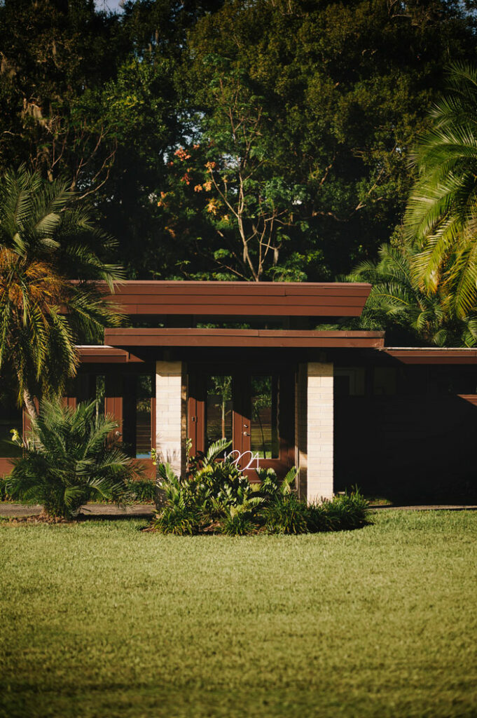
In 1963, architect Bruce Spencer designed a home that was greatly influenced by the modernist movement of its time. Over 50 years later, current homeowners Jason and Hillary DeMeo, pay homage to the same house that continues to deliver a compelling “sprinkling of light.”
Glass is everywhere now. But it hasn’t always been. In a modern world full of skyscrapers, we may not think of glass as a semi-precious material. It wasn’t until the 15th century that transparent glass was created and, even then, it was still made by hand. Glass was blown into balloons and then cut and unfurled, or it was blown and spun into discs, known as crown glass. This process leaves behind a visible source mark.
It is a quite a beautiful process, however slow and costly. Just imagine the first time people had the ability to use glass in buildings. Before glass, buildings were either opened or closed — open to the elements or shuttered and dark. With glass, we can create a building envelope that is closed and secure, yet allows light in. This blurs the line between inside and outside.
In medieval times, glass was used in churches and stained glass; it took on a spiritual connotation. I think there’s a connection to that idea that is still true today. Glass serves as a transferer of light. It dissolves the realm between indoor and outdoor, the realm between man and God.
SIMILAR YET DIFFERENT
Built in 1963 by Bruce Spencer, the home to current owners Jason and Hillary DeMeo employs glass in fantastic ways. The house, in many ways, draws on principles from the Sarasota School of Architecture.
[Modula id=’83’]
“With glass, we can create a building envelope that is closed and secure, yet allows light in. This blurs the line between inside and outside.”
The Sarasota School, while not an actual school, is a term coined for a movement of regional modernism, also referred to as Florida Modernism. It is essentially founded in organic architecture, and inspired by its natural place and international style. Two similar and yet different architectural styles converged in a post-war Florida.
We had Frank Lloyd Wright in Central Florida influencing many architects, including Bruce Spencer. In addition, there was Paul Rudolph, who came to work under Ralph Twitchell after studying under Walter Gropius at Harvard. Gropius was the head of Bauhaus and came to America after facing pressure from Nazi Germany. These two different schools of thought converged all across America. The result being a modernist movement with unique traits for various locales.

IT’S ALL IN THE DESIGN
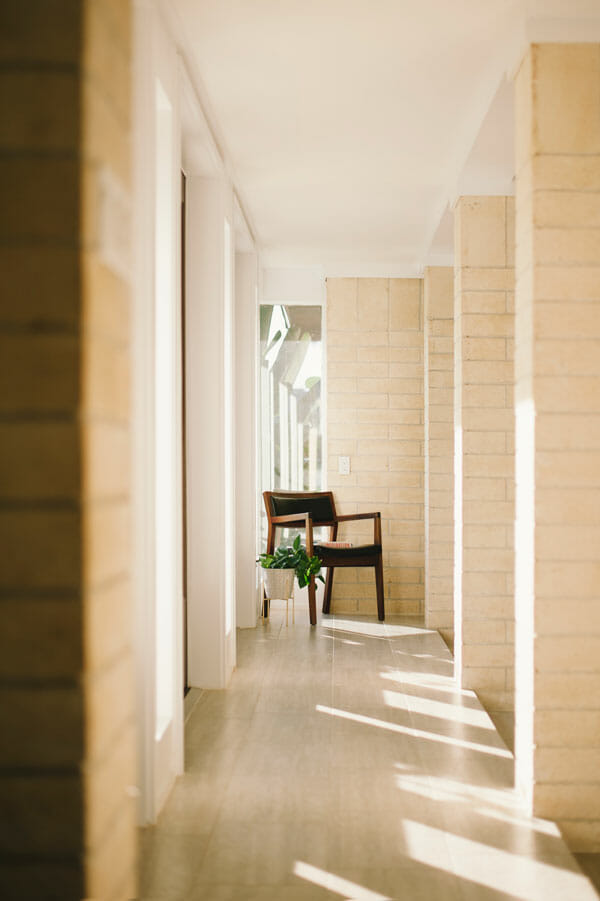
Lots of clerestory windows provide top lighting to this space. Let’s think about what other buildings feature top-lit spaces: chapels, naves, and art galleries use top lighting. The home provides a heavenly glow; a calm light that floods the space, but the light is not direct.
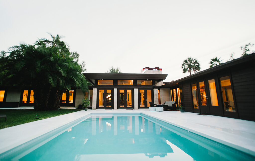
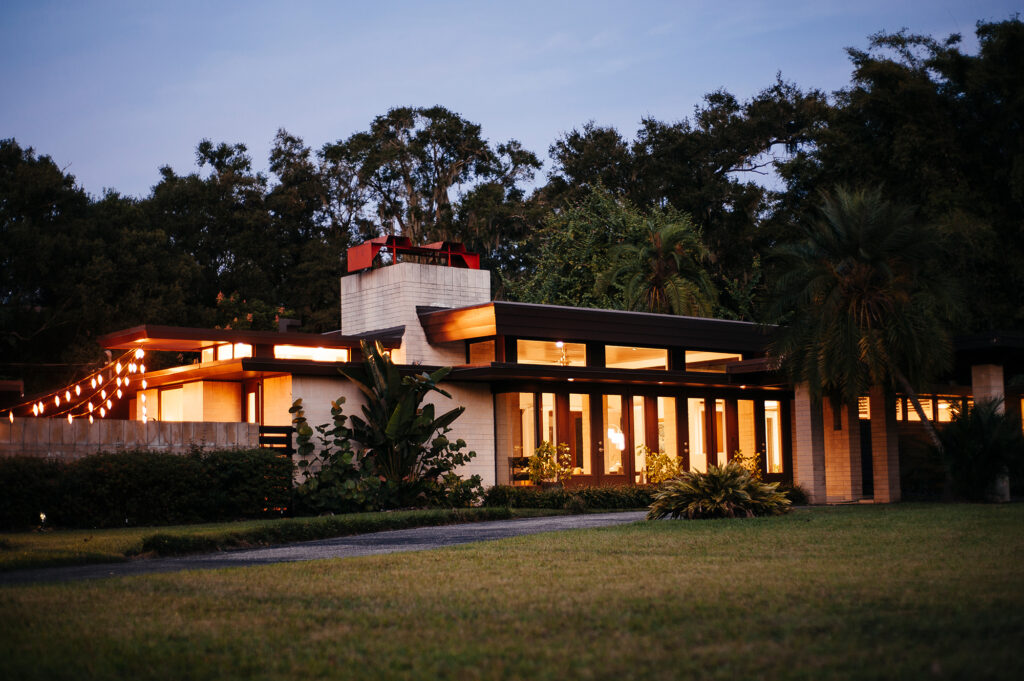
In 2005, Bruce Spencer told The Ledger newspaper he was proud of the way the house delivers a “sprinkling of light.” The multi-level roofline provides height in places of drama, and the glass between the roof creates a sense of floating plates — as if the roof is floating above the house. Several rooms are cornerless, featuring glass corners in its place. The effect is that the building dissolves into the large yard. Corner windows allow the building to feel like it is merging with the site. It’s a subtle effect that plays out on everyone whether they realize it or not. Glass is used expertly to dissolve the house upward and outward.
Adding to the drama of height and dissolving views, the central sunken living room is surrounded by an internal masonry colonnade with a commanding Ocala block fireplace. It’s the most formal space in the house. The house is constructed of materials that feel holistic to the space. Ocala block (which Frank Lloyd Wright also used) is a special block. It is created using a specific mix of aggregates and sand that give it a distinctive warm tone. The block is then left unpainted which garners a negative response because it feels cold. But when you put care into the materials and leave them in their raw state, a certain honesty resonates with people. The house also features wood and terrazzo floors throughout. The kitchen also has a narrow second-height ceiling. From the outside, these protrusions begin to feel like decks of a ship.

The glass serves as a transferer of light. It dissolves the realm between indoor and outdoor, the realm between man and God.
The house, having been built before air conditioning, has been retrofitted with several units to service its rambling floor plan. The owners have found this to be very efficient as they can micro-control zones based on their use. This is an interesting lesson that can be applied today. Besides employing passive cooling, perhaps we should also be segmenting the home by use — like airlocks of a ship. The kitchen often needs not be connected to the home. In fact, early Florida pioneers knew this. The kitchen is hot and smelly when in use. Bedrooms are kept cooler but only need be during sleeping hours.

A HOME’S ESSENCE
In regards to thinking about specificity of place, a term I love is genius loci. In ancient Roman times, genius loci referred to a protective spirit of a place. In contemporary use, it can simply be thought of as the essence or the spirit of the place. Through architecture we can capture that. Or, perhaps, a better way to think of it rather than containing is to pay homage to. But maybe successful architecture is doing more than just paying homage, which feels superficial. Good architecture is allowing that genius loci to flow through the site. Successful architecture, or architecture that resonates with people the most, is of, for, and by the place.

